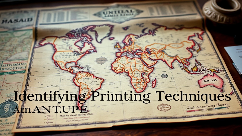
Identifying Printing Techniques in Antique Maps

Many collectors assume that if a map looks old, it was printed using a single, uniform method. That's a mistake. Identifying the specific printing technique is the difference between owning a valuable 17th-century copperplate engraving and a cheap 20th-century reproduction. This guide breaks down the physical characteristics of woodcuts, copperplate engravings, lithography, and steel engravings so you can identify what's actually sitting on your desk.
How can you tell if a map is a woodcut or an engraving?
The primary difference lies in the depth of the ink and the physical impression left on the paper. Woodcuts, common in the 15th and 16th centuries, use a relief process where the raised surfaces are inked, often resulting in thicker, bolder lines and a slightly "chunky" appearance. Engravings, however, are intaglio processes where ink sits in recessed grooves carved into metal plates.
To identify an engraving, look for the "plate mark." This is a visible indentation around the border of the map caused by the heavy pressure of the printing press. If you see a sharp, rectangular depression where the metal plate met the paper, you're likely looking at a copperplate engraving. If the lines are incredibly fine—almost hair-like—and there is no indentation, it might be a woodcut or a later lithograph.
Check the texture of the lines under a magnifying glass. Woodcuts often show slight irregularities or "breaks" in the lines because the wood grain can interfere with the ink. Engravings are much more precise. You'll see a level of detail in the cross-hatching that woodcuts simply can't replicate. It's a matter of physics—metal holds much finer detail than wood.
A quick way to check is to look at the edges of the lines. In a woodcut, the ink might bleed slightly into the paper fibers. In a copperplate engraving, the ink sits "in" the paper, often creating a tiny raised ridge of ink that you can feel with a fingernail if you're careful (though I don't recommend touching your collection too much).
What are the signs of a lithographic map?
Lithographic maps are characterized by a lack of physical texture and a smoother, more "drawn" appearance. Unlike the deep grooves of an engraving, lithography is a planographic process, meaning the printing surface is flat. This means there is no plate mark and no heavy indentation in the paper.
When you examine a lithograph, look for a grainy or "stippled" texture in the shaded areas. Because lithography relies on the chemical repulsion of oil and water, the ink often has a slightly soft, velvety look rather than the sharp, biting lines of an engraving. If the map looks like it was drawn with a pencil or a crayon rather than carved with a tool, it's likely a lithograph.
Common characteristics of lithography:
- No Plate Mark: The paper remains flat around the image.
- Grainy Texture: Shading often looks like fine dots or a soft wash.
- Color Application: Colors are often applied in layers that might overlap in a way that looks slightly "painterly."
- Consistency: The lines are smooth and lack the "cragginess" of early relief printing.
Many 19th-century maps use color lithography, which can be quite beautiful. However, be careful. High-quality modern reproductions often mimic this look. If the colors look too "perfect" or the ink looks like it's sitting on top of the paper rather than being part of it, proceed with caution. You can learn more about the history of printing methods on the Wikipedia page for Lithography to see how the chemistry evolved.
How do you identify a steel engraving?
Steel engravings are the descendants of copperplate engravings, used extensively in the 19th century for high-detail maps and scientific charts. While copper is soft and wears down quickly, steel is incredibly hard, allowing for much finer, more durable lines. This allowed for a massive increase in the precision of cartographic data.
The tell-tale sign of a steel engraving is the sheer density of the detail. The lines are much thinner than those found in copperplate engravings. If you see a map with an almost microscopic level of detail in the topography or sea monsters, it's likely a steel engraving. The ink lines are incredibly sharp and consistent across the entire sheet because the steel plate didn't degrade as the copper one did.
One thing to watch for is the "age" of the plate. Because steel is so hard, these plates could print thousands of copies without losing detail. This means a map printed in 1880 might look just as sharp as one printed in 1850. This can be confusing if you're trying to spot authentic age on antique maps, as the sharpness is a sign of the medium, not necessarily the age of the specific sheet.
Here is a comparison of the most common historical printing techniques:
| Technique | Primary Material | Physical Impression | Line Quality |
|---|---|---|---|
| Woodcut | Wood Block | Subtle/None | Thick, bold, slightly irregular |
| Copperplate | Copper Plate | Deep Plate Mark | Fine, elegant, varying thickness |
| Steel Engraving | Steel Plate | Shallow Plate Mark | Extremely fine, dense, precise |
| Lithography | Limestone/Metal | Flat/No Impression | Soft, grainy, looks "drawn" |
When you're out at an estate sale or browsing an online auction, keep a small jeweler's loupe in your pocket. You can't identify these techniques with the naked eye alone. You need to see how the ink interacts with the paper fibers. A 10x or 20x magnification is usually enough to see the difference between a printed line and a hand-drawn line.
The catch with modern reproductions is that they often use offset lithography. This is a high-speed process used in modern printing presses. Under a loupe, offset printing looks like a series of tiny, uniform dots (the CMYK pattern). An authentic antique map—whether it's a woodcut or a copperplate—will never have that "dot" pattern. It will have actual ink shapes, not a digital grid of dots.
If you find yourself confused by a map's origin, look at the paper itself. Historical paper was often handmade and had a specific "tooth" or texture. Modern paper is often too smooth or too uniform. If the paper feels "too perfect," the printing technique might be a modern imitation. If you're interested in how to protect these delicate items once you've identified them, check out my guide on how to properly frame and display vintage maps.
Don't be afraid to look closely. The more you study the physical "build" of the ink, the better you'll become at discerning a true antique from a clever facsimile. It's a skill that takes time, but once you see that first real copperplate indentation, you'll never look at a map the same way again.