Hidden Symbols in Renaissance Cartography

The Meaning of Sea Monsters
Celestial Motifs and Zodiac Signs
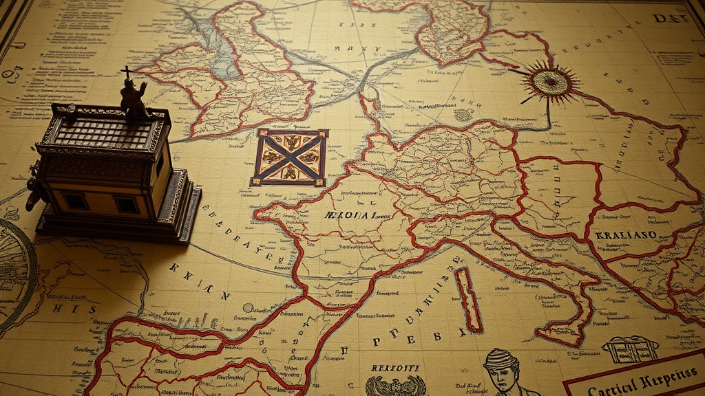
Compass Roses and Directional Ornaments
Heraldic Shields and Royal Emblems
A collector in London recently spent months tracking down a specific 16th-century celestial chart, only to realize the most valuable part wasn't the geography. It was a tiny, hand-colored engraving of a constellation that served as a secret signature for the engraver. Most people look at a Renaissance map and see lines and borders. They miss the encoded messages, the political jabs, and the hidden wealth of symbols tucked into the margins. This post looks at the specific iconography used by cartographers to communicate status, power, and even danger.
Understanding these symbols changes how you value a piece. A map isn't just a tool for direction; it's a piece of propaganda. If you're looking at a piece by someone like Abraham Ortelius or Gerardus Mercator, you aren't just looking at a map. You're looking at a coded document.
What Are the Common Symbols in Renaissance Maps?
Common symbols in Renaissance cartography include heraldic crests, mythological creatures, and religious iconography used to denote ownership or territory. During this era, mapmakers didn't just want to show where a mountain was; they wanted to show who owned the mountain and why they had the divine right to do so.
Take the use of the Compass Rose. While we see them as simple directional tools today, in the 1500s, the complexity of the rose often signaled the sophistication of the printer. A highly detailed, multi-colored rose wasn't just decoration—it was a status symbol for the person who commissioned the work.
Then there are the Sea Monsters. These aren't just "cool drawings." They were often used to mark unexplored or dangerous waters. If a map shows a massive Leviathan near a coastline, the cartographer is telling you that the area is either unexplored or culturally "other." It's a way to fill the "white space" of the unknown with something that evokes fear and awe.
Here is a breakdown of how different symbols functioned in the 16th and 17th centuries:
- Heraldic Shields: These established legal ownership and political allegiance. If a map shows the Tudor Rose, it's a political statement.
- Cartouches: These are the decorative frames around the title or scale. They often contain personifications of the elements—wind, water, or earth—to show the map's scope.
- Wind Heads: These are the faces of gods or spirits blowing air. They represent the cardinal winds and add a sense of movement to static paper.
- Religious Icons: Crosses or saints were frequently included to suggest that the territory was under divine protection.
Why Do Cartographers Use Mythological Creatures?
Cartographers used mythological creatures to represent the unknown, the dangerous, and the culturally misunderstood. These illustrations served as a visual shorthand for "this is a place where your rules don't apply."
It wasn't just about being artistic. It was about filling the voids. In an era before satellite imagery, the ocean was a massive blank canvas. By drawing a Kraken or a sea serpent, the artist provided a sense of scale and a warning. This is a topic that connects deeply to the evolution of sea monster illustrations, where we see how these creatures moved from being literal warnings to purely decorative elements.
Interestingly, these creatures also helped with the "branding" of a map. A map filled with exotic beasts looked more expensive and more "exotic" to a buyer in Europe. It turned a functional tool into a luxury collectible. You'll notice that as surveying became more accurate, these creatures slowly vanished, replaced by much more boring, accurate topographical lines.
If you're looking at a map and see a Griffin or a Sphinx, don't assume it's a mistake. It's a deliberate choice to suggest that the land is steeped in myth and mystery.
How Do You Identify a High-Quality Antique Map?
You identify a high-quality antique map by examining the paper-making techniques, the precision of the copperplate engraving, and the presence of hand-applied color. A true Renaissance-era map will have distinct characteristics that modern reproductions struggle to mimic.
First, look at the plate mark. This is the indentation left by the metal plate being pressed into the damp paper. If you don't see a physical indentation around the border of the map, you're likely looking at a modern print. This is a vital step for anyone learning how to start collecting vintage maps.
Second, check the watermark. Authentic old paper often has a watermark—a subtle pattern visible when held up to the light. This was the "security feature" of the 16th century. It tells you the quality of the paper and can even help date the map more accurately.
| Feature | High-Quality Antique (Authentic) | Modern Reproduction |
|---|---|---|
| Paper Texture | Heavy, irregular, often contains "laid lines" from the mold. | Smooth, uniform, often looks too "perfect." |
| Coloring | Hand-applied watercolor; colors may bleed slightly or fade unevenly. | Offset or digital printing; colors are perfectly uniform. |
| Engraving | Deep, tactile lines from a copper or steel plate. | Flat, shallow lines or no physical depth at all. |
| Smell | A distinct "old paper" scent (vanillin/lignin breakdown). | Often smells like ink or fresh chemicals. |
The catch? Even with these checks, a very high-end reproduction can fool the untrained eye. Always buy from reputable dealers who provide a certificate of authenticity. If the price seems too good to be true, it probably is. A genuine 16th-century map with vibrant, hand-colored mythological beasts is a significant investment.
When you do find an authentic piece, how you treat it matters. The same light that makes the colors pop in a museum is the same light that will destroy your collection if you aren't careful. I've written about preserving paper treasures from sunlight, which is a must-read if you plan on displaying these pieces.
One thing to watch for is the "foxing." These are the little brown spots that appear on old paper. While some collectors find them charming, they are actually a sign of fungal growth or metal oxidation. It's a sign of the map's age, but it can also be a sign of poor storage in the past.
The symbols in these maps are more than just pretty pictures. They are the fingerprints of the people who made them. They tell us what they feared, what they worshipped, and what they wanted to own. Next time you hold a vintage map, don't just look at the coastlines. Look at the dragons. Look at the shields. Look at the faces in the wind. That's where the real story lives.