Common Cartographic Errors Found in Historical Maps

The Mystery of Phantom Islands
Distorted Coastlines and Missing Landmasses
Mythical Sea Monsters and Sea Serpents
Incorrect Longitude and Latitude Measurements
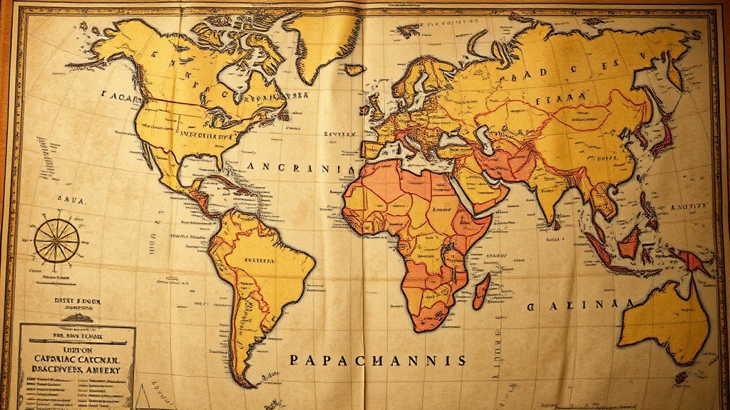
Many collectors assume that a historical map's accuracy is a direct reflection of its value, but that's a mistake. In reality, the most interesting errors—the "mistakes" that define an era—often make a map more desirable to seasoned collectors. This post looks at the specific cartographic blunders, from phantom islands to distorted coastlines, that characterize certain periods of map-making. Understanding these errors helps you differentiate between a poorly made contemporary reproduction and a genuine piece of history.
Why Do Historical Maps Contain Errors?
Historical maps contain errors because cartographers relied on incomplete, secondhand, and often unverified data from explorers and sailors. Before the era of satellite imagery and GPS, map-making was a game of guesswork and fragmented reports. A single captain's flawed logbook could result in a "new" coastline appearing on maps for decades. These inaccuracies aren't just accidents; they are the fingerprints of human discovery and the limitations of the era's technology.
The lack of standardized measurement tools meant that longitudinal errors were frequent. If a navigator couldn't accurately calculate their position relative to the sun or stars, the entire map's geometry would shift. This wasn't just a minor hiccup—it was a fundamental problem of the age. You'll see it in everything from the way the Americas are shaped to the way the Pacific Ocean is stretched.
Collectors often look for these "glitches" to verify authenticity. For instance, if a 16th-century map looks too "perfectly" aligned with modern geography, it’s a red flag. You should be spotting authentic age on antique world maps by looking for these specific types of historical inaccuracies.
What Are Common Types of Cartographic Errors?
Common errors include phantom islands, distorted coastlines, and incorrect longitudinal measurements. These errors generally fall into three distinct categories: geographical, mathematical, and purely speculative. When you examine a piece, you're looking at a snapshot of what people *thought* they knew, not what was actually there.
1. Phantom Islands and Terra Incognita
One of the most famous errors in cartography is the appearance of islands that never existed. These "phantom islands" were often the result of mirages (Fata Morgana) or sailors misidentifying icebergs or low-lying clouds. The most notorious example is Hy-Brasil, an island off the coast of Ireland that appeared on maps for centuries. These weren't just mistakes; they were often treated as established facts until they were definitively disproven.
Another common feature is Terra Incognita (unknown land). Cartographers would often fill empty spaces with decorative elements or mythical lands to make the map look "complete." It's a bit like a designer using "Lorem Ipsum" text—it fills the space, but it isn't actually real. If you see a large, unlabeled landmass in the middle of an ocean, you're looking at a classic era-specific error.
2. The Longitude Problem
For centuries, determining latitude was easy, but longitude was a nightmare. Because sailors couldn't accurately measure time at sea, they couldn't determine their east-west position. This led to massive distortions in the width of oceans and the placement of continents. You might notice a map where the Atlantic looks far too wide or the Pacific looks far too narrow. This is a direct result of the inability to use accurate chronometers during the height of the Age of Discovery.
3. Coastline Distortions
Coastal outlines in older maps are often "blobby" or exaggerated. This happened because map-makers often relied on verbal descriptions from sailors rather than direct surveying. If a sailor described a bay as "deep and jagged," the cartographer might draw it with extreme, unrealistic detail. It's a subjective interpretation of a physical reality. (It’s also why many old maps look more like art than scientific tools.)
Here is a breakdown of how these errors typically manifest in different map types:
| Map Type | Common Error | Reason for Error |
|---|---|---|
| Celestial Maps | Incorrect Star Placement | Limited telescopic precision |
| World Maps (Mappa Mundi) | Exaggerated Continents | Unreliable maritime logs |
| Topographic Maps | Missing Elevation Data | Lack of standardized surveying |
| Nautical Charts | Phantom Reefs/Islands | Optical illusions/Mirages |
How Do You Identify a Fake Map Using Errors?
You identify a fake map by checking if the errors are "too modern" or if the inaccuracies are inconsistent with the era's technology. A genuine antique map will have errors that make sense for its time—such as a missing coastline or a misplaced island. A modern forgery often fails because it tries too hard to look "old" but uses a geographic layout that is actually too accurate for the supposed date of the map.
A common trick in the reproduction market is to use a modern, accurate map and simply apply a "sepia" filter or a digital texture. However, these reproductions will lack the structural errors inherent to the original period. For example, a "17th-century" map that shows the correct shape of the Australian coastline is almost certainly a fake. In the 1600s, the details of Australia were still largely a mystery to European cartographers.
Watch out for these red flags:
- Perfect Geometry: If the map looks too "clean" and follows modern borders perfectly, it's likely a reproduction.
- Anachronistic Details: Look for modern place names or geographic features that wouldn't have been known yet.
- Inconsistent Scale: A map might have an old style but use a scale that is too precise for its purported era.
If you're worried about the physical condition and how to display your pieces safely, check out my guide on how to properly frame and display vintage maps. A well-framed map is much easier to enjoy, regardless of its errors.
The Value of the "Mistake"
It's a bit ironic, isn't it? The very things that make a map "wrong" are often what make it valuable. A collector isn't just buying a piece of paper; they are buying a record of human misunderstanding. These errors provide a window into the mindset of the people who lived through those eras. They show us exactly where the boundaries of human knowledge stood at any given moment.
When you're browsing through auction sites or local antique shops, don't look for perfection. Look for the stories. A map with a phantom island or a distorted ocean tells a story of a sailor lost at sea or a scholar working from a desk in a library halfway across the world. That's the real magic of collecting. It's not about the math; it's about the history.
If you want to dive deeper into the technicalities of how these maps were produced, the Wikipedia page on Cartography offers a great foundation for understanding the transition from manual drafting to modern methods. It helps put the errors into a broader scientific context.
The next time you hold an old map, look closely at the edges of the known world. See if you can find the gaps, the missing islands, and the stretched oceans. Those aren't just mistakes—they are the places where history was still being written.