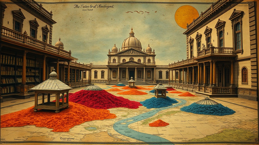
Forgotten Colors and Lost Pigments in Antique Cartography

Lapis Lazuli and the Deepest Blues
Cochineal: The Secret of Crimson Maps
Verdigris and the Green of Antiquity
Saffron and the Golden Glow of Parchment
Imagine holding a hand-colored 17th-century Dutch map where the deep, vibrant greens of the coastline have faded into a sickly, translucent yellow. This isn't just age; it's the chemical reaction of the pigment itself. This post examines how the chemistry of historical pigments—like verdigris, orpiment, and realgar—dictates the way antique maps look today and why certain colors disappear while others remain unnervingly bright. Understanding these materials helps you distinguish between a map that is naturally aging and one that has been poorly preserved or even artificially aged.
Collecting isn't just about the geography. It's about the physical substance of the paper and the ink. When you look at a map from the 1600s, you aren't just looking at a drawing; you're looking at a chemical reaction in progress.
What Causes Colors to Fade in Antique Maps?
Color loss in antique maps is primarily caused by light sensitivity, oxidation, and the inherent instability of organic pigments. Most vintage maps were hand-colored after the printing process, meaning an artist applied watercolor or gouache directly to the paper. These pigments often rely on organic binders or heavy metals that react poorly to the environment.
Light is the biggest enemy here. UV rays break down the molecular bonds in pigments, a process known as photodegradation. If you've ever seen a map where the reds have turned to a dull brown, you're seeing the death of the pigment's light-reflective properties. It's a slow, irreversible decay.
Then there's the "burning" effect. Some pigments are actually corrosive. For example, copper-based greens (verdigris) are notorious for eating through the paper over centuries. You might see a map where the green-tinted oceans have literally burned a hole through the parchment. This isn't just a color change—it's structural damage.
The catch? Even in a dark drawer, these chemical processes continue. Oxidation occurs when the pigment reacts with the oxygen in the air. It's a constant, silent battle between the art and the atmosphere.
Which Pigments Were Used in Historical Cartography?
Cartographers and colorists used a specific palette of mineral and organic substances that were often toxic and highly reactive. These materials gave the maps their distinct, sometimes garish, appearance. Knowing these names helps you identify the "mood" of a specific era of map-making.
Here is a breakdown of the most common pigments found in high-end antique maps:
- Orpiment: A bright, arsenic-based yellow. It was prized for its brilliance but is incredibly toxic and can react with lead-based pigments.
- Verdigris: A green pigment made from copper salts. It's famous for its tendency to turn acidic and damage the paper substrate.
- Cochineal: A deep red derived from crushed insects. It provides a vibrant crimson that remains relatively stable if kept away from direct light.
- Ultramarine: Historically made from ground lapis lazuli, this was the gold standard for blue. It's much more stable than the cheaper, synthetic blues that came later.
- Iron Gall Ink: While not a "color" in the decorative sense, this was the standard for lines and text. Over time, the iron in the ink can cause the lines to "halo" or even crack the paper.
If you're looking at a map and the colors seem almost "too" bright, check the edges of the pigment. If the colors look like they are sitting on top of the paper rather than being part of it, you might be looking at a modern reproduction or a heavily restored piece. You can learn more about the technical aspects of paper aging through the Library of Congress archives, which host extensive digital collections of historical documents.
If you're worried about how your own collection is holding up, you should check out my previous post on why most collectors fail at lighting for vintage paper. Lighting is the single most important factor in preventing this chemical decay.
How Can You Identify a Hand-Colored Map?
You can identify a hand-colored map by looking for slight irregularities in the pigment application and checking for "bleed" or "burn" through the reverse side of the paper. Printed color (chromolithography) looks uniform and mechanical, whereas hand-coloring is organic and slightly imperfect.
A magnifying glass is your best friend here. When you look at a hand-colored map, the color won't perfectly fill every tiny corner of the engraved lines. There is often a slight "halo" or a sense of depth where the brush hit the paper. This is a sign of a high-quality, hand-finished piece.
Use this table to differentiate between the two:
| Feature | Hand-Colored (Original) | Printed Color (Chromolithograph) |
|---|---|---|
| Precision | Slightly uneven, organic borders. | Perfectly uniform, mechanical. |
| Texture | Visible brush strokes or pigment clumps. | Flat, consistent ink density. |
| Reverse Side | May show pigment "burn" or bleed-through. | Usually clean or shows print-side ink only. |
| Color Depth | Variations in saturation within a single area. | Completely uniform color saturation. |
One thing to watch for: many 19th-century maps were printed with color already integrated into the plate. These are much more stable than the hand-colored maps of the 1600s. The 1600s-era maps are the ones where the pigment is a separate, volatile entity added to the paper. This distinction changes the value of the piece significantly.
Does Pigment Degradation Affect Value?
Yes, pigment degradation can significantly lower the value of a map, especially if the chemical reaction has caused structural damage like "acid burn" or holes in the paper. A map with vibrant, well-preserved color is a rarity and commands a premium, whereas a map with heavy "verdigris rot" is often viewed as a damaged specimen.
However, there is a nuance to this. A "natural" fade—where a color simply becomes more muted and pastel—is often accepted by collectors. This is seen as part of the item's "patina." On the flip side, when the pigment has physically destroyed the paper, that's a problem. A map with a hole in the middle of the Atlantic Ocean because of a copper-based green is a damaged map, period.
When buying, always ask the seller about the condition of the color. If they say "the colors are bright," that's a good sign. If they say "the colors have faded," you need to determine if it's a graceful fade or a destructive one. It's a fine line. If you want to ensure your collection stays in top shape, read my guide on how to care for and display your vintage maps.
The market for high-quality, brightly colored maps is much more competitive than the market for black-and-white prints. If you find a piece with intact, vivid colors—especially those involving expensive pigments like lapis lazuli or stable cinnabar—you've found a winner. Just keep it away from the sun. A single afternoon of direct sunlight can do more damage than a decade of gradual aging.
The science of color is part of the charm of the hobby. It makes every map a living thing. It's not just a static image; it's a chemical entity that is constantly changing. That's what makes the hunt so much fun.